Comparing the Paint Colors of the Year: Our Honest Take on Behr, Pantone, Sherwin-Williams & Benjamin Moore
Every year, the announcement of “Paint Color of the Year” sparks conversation across the design world. These colors are meant to reflect not just aesthetics, but culture — how we’re living, what we’re craving, and where design is headed next. While each company approaches this differently, their 2026 picks tell a bigger story about contrast: bold versus safe, expressive versus restrained.


Here’s our breakdown of each color — and our honest opinion on how they stack up.
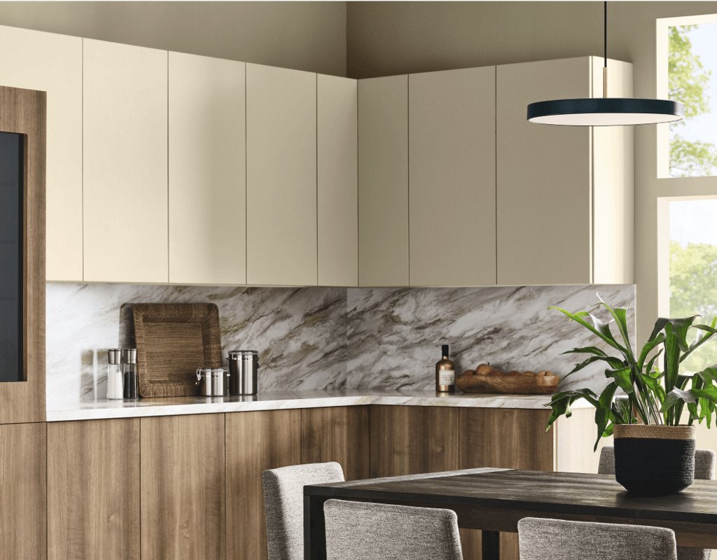
Behr — Hidden Gem
Behr’s Hidden Gem is a smoky jade green that feels rich, layered, and intentional. It’s moody without being dark, colorful without being overwhelming. This color feels very in tune with where interiors are heading: expressive, soulful, and grounded in nature.
We love how Hidden Gem can shift depending on the space. In one room it reads coastal and calming; in another it feels vintage and cozy. It works beautifully on cabinetry, accent walls, or even full rooms when balanced with warm woods and soft neutrals. Of all the picks, this one feels the most confident in embracing color while still remaining livable.
Our take: A strong, relevant choice that reflects the growing desire for depth and personality in interiors.


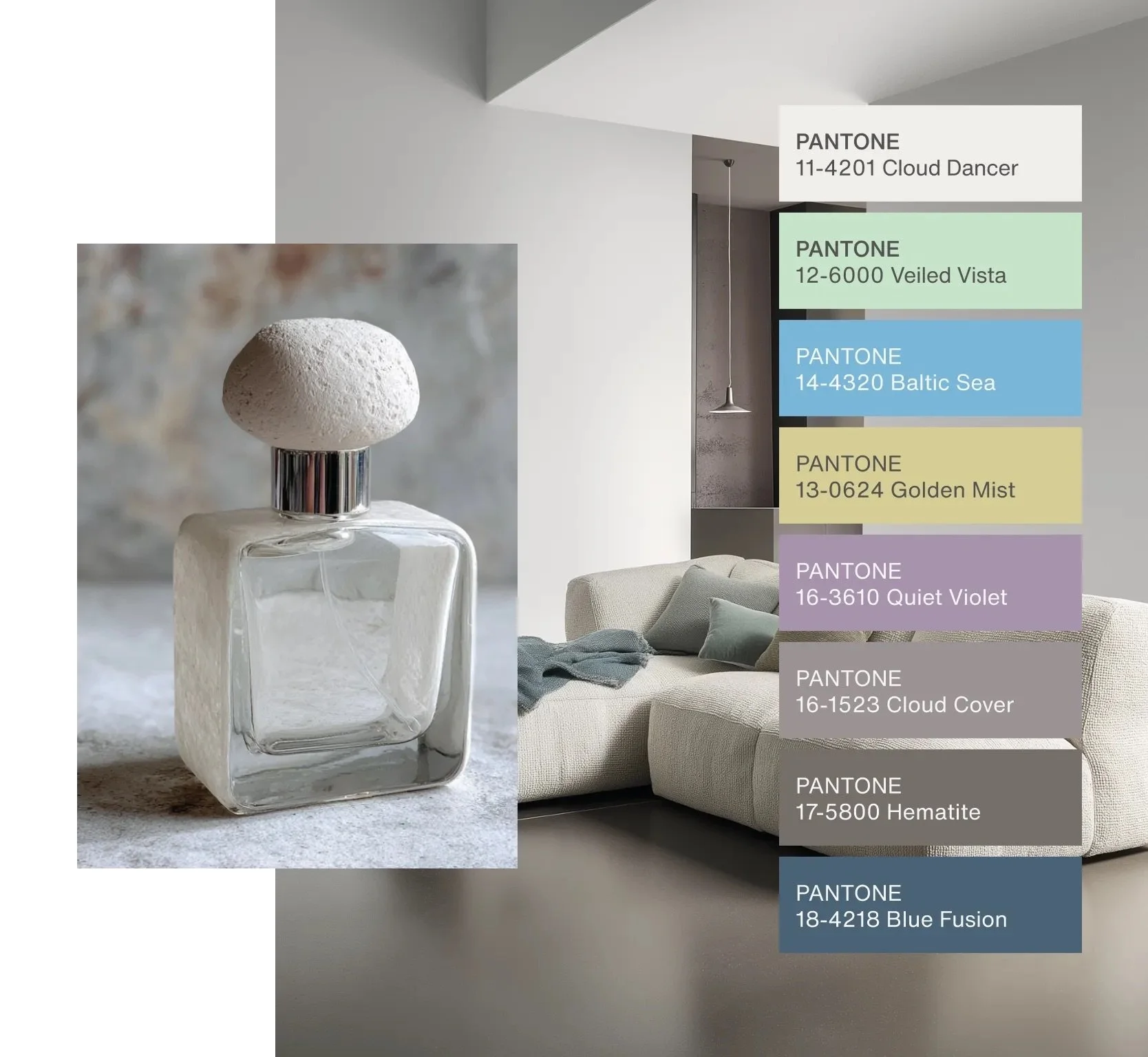
Pantone — Cloud Dancer
Pantone’s Cloud Dancer is a soft, airy white meant to evoke calm and clarity. While we understand the intention — white is timeless, clean, and universally appealing — this pick ultimately felt underwhelming to us.
Design trends have been moving away from ultra-safe choices and toward more playful, expressive elements: colorful tile, patterned wallpaper, statement stone, and layered textures. Against that backdrop, choosing white as the Color of the Year feels like a missed opportunity. White will always have a place in design, but it doesn’t push the conversation forward.
Our take: Clean and classic, yes — but uninspiring. In a moment where creativity and color are thriving, this choice feels a bit too safe.
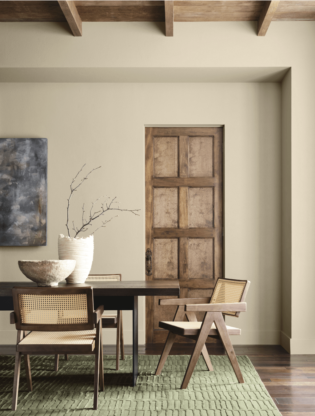
Sherwin-Williams — Universal Khaki
Universal Khaki lands squarely in the “reliable neutral” category. It’s warm, adaptable, and easy to build around — a color that works across a wide range of spaces and styles. This is the kind of paint color that designers reach for when they want cohesion without committing to bold color.
While it may not be exciting at first glance, its strength lies in versatility. It pairs well with deeper greens, earthy reds, creamy whites, and natural materials. In open floor plans or whole-home applications, this color makes a lot of sense.
Our take: Not flashy, but practical and thoughtful. A solid choice for those wanting warmth without risk.
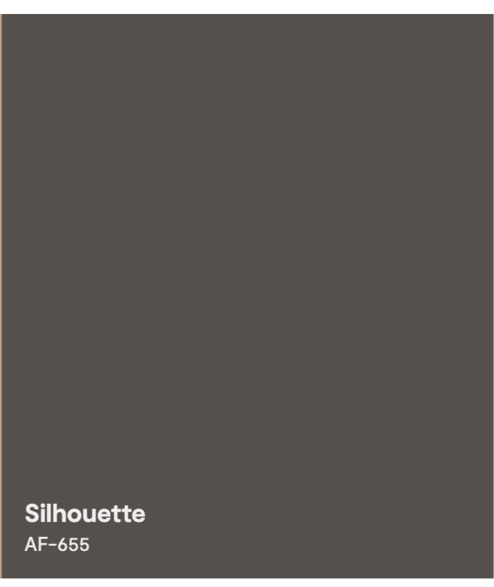
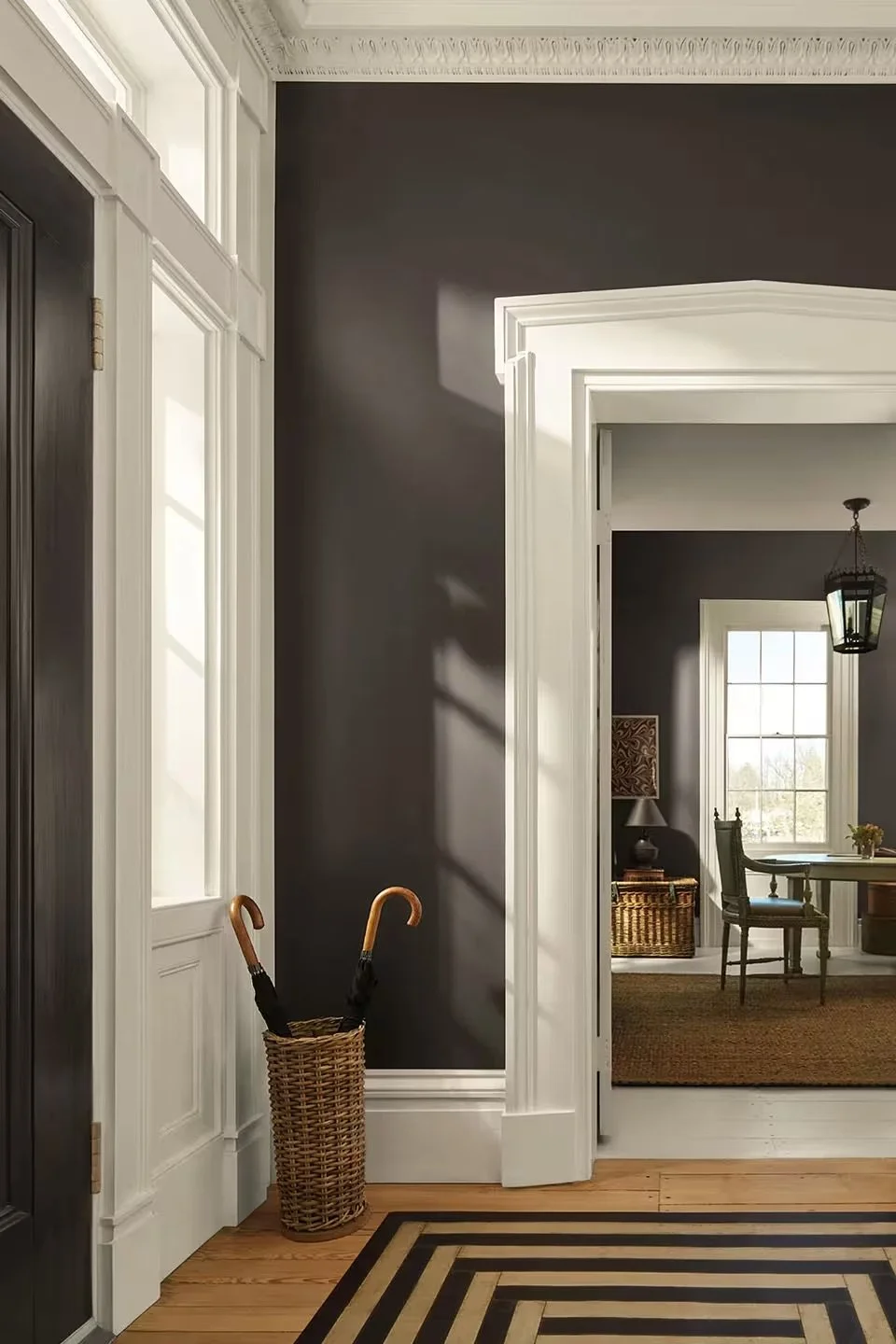
Benjamin Moore — Silhouette
Benjamin Moore’s Silhouette is a deep espresso brown with subtle charcoal undertones, and it feels undeniably sophisticated. This color brings drama in a tailored, refined way — less trendy, more timeless luxury.
We love this pick for studies, dining rooms, cabinetry, or anywhere you want to create intimacy and depth. It reflects the growing popularity of darker, moodier interiors that still feel elevated rather than heavy.
Our take: Bold, elegant, and very on trend with the move toward rich, enveloping spaces.

The Bigger Picture
Taken together, these four colors highlight a split in the design world. On one side, there’s a clear push toward warmth, depth, and color — seen in Behr’s Hidden Gem and Benjamin Moore’s Silhouette. On the other, we see brands leaning into safety and neutrality with Pantone’s white and Sherwin-Williams’ khaki.
For us, the most exciting choices are the ones that reflect how people are actually designing their homes right now: embracing personality, color, and moments of joy through materials like tile, wallpaper, and paint.
Final Thoughts
If you’re looking for something expressive and current, Behr and Benjamin Moore lead the way this year. Sherwin-Williams offers a dependable neutral that will stand the test of time. Pantone, while elegant, feels like it stayed on the sidelines during a moment when design is asking for more creativity and boldness.
At the end of the day, the best Color of the Year is the one that resonates with how you want your space to feel — but we’ll always root for the colors that dare to say a little more.